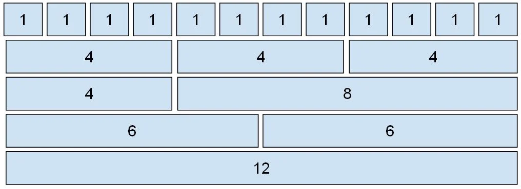
The Bootstrap 5 grid system is designed with flexbox and supports up to 12 columns across the page. If we don't want to use all 12 columns separately, you can combine them to make wider columns.
The grid system is responsive, and the columns will re-arrange themselves automatically based on screen size. It is not necessary to use all 12 available columns. Make sure the total is less than or equal to 12.
We can utilize Bootstrap's default grid classes to easily create layouts for various devices like mobile phones, tablets, laptops, and desktops.
Screen width must be equal to or greater than 576px
.col-md
Medium devices
Screen width must be equal to or greater than 768px
.col-lg
Large devices
Screen width must be equal to or greater than 992px
.col-xl
Extra-large devices
Screen width must be equal to or greater than 1200px
.col-xxl
Double extra (xxlarge) devices
Screen width must be equal to or greater than 1400px
Example-1
<html >
<head>
<title> Bootstrap 5 Example </title>
<meta name = "viewport" content = "width=device-width, initial-scale = 1">
<link href = "https://cdn.jsdelivr.net/npm/bootstrap@5.1.3/dist/css/bootstrap.min.css" rel="stylesheet">
<script src = "https://cdn.jsdelivr.net/npm/bootstrap@5.1.3/dist/js/bootstrap.bundle.min.js">
</script>
</head>
<body>
<div class="container">
<h1>Responsive Columns</h1>
<p>Resize the browser window to see the effect.</p>
<p>The columns will automatically stack on top of each other when the screen is less than 576px wide.</p>
<div class="row">
<div class="col-sm-3 ">.col</div>
<div class="col-sm-3">.col</div>
<div class="col-sm-3 ">.col</div>
<div class="col-sm-3 ">.col</div>
</div>
</div>
</body>
</html>
Example-2
<html >
<head>
<title> Bootstrap 5 Example </title>
<meta name = "viewport" content = "width=device-width, initial-scale = 1">
<link href = "https://cdn.jsdelivr.net/npm/bootstrap@5.1.3/dist/css/bootstrap.min.css" rel="stylesheet">
<script src = "https://cdn.jsdelivr.net/npm/bootstrap@5.1.3/dist/js/bootstrap.bundle.min.js">
</script>
</head>
<body>
<div class="container">
<h1>Two Unequal Responsive Columns </h1>
<p>Resize the browser window to see the effect.</p>
<p>The columns will automatically stack on top of each other when the screen is less than 576px wide.</p>
<div class="row">
<div class="col-sm-4 ">.col</div>
<div class="col-sm-8 ">.col</div>
</div>
</div>
</body>
</html>