Bootstrap 5-Containers
In Bootstrap all site contents and a grid system exist within a container,which is containing element.
There are three type of container
- Container: The ".container class" has a maximum width at each responsive breakpoint.
- Container-fluid: The ".container-fluid" class has a width of 100 percent at all breakpoints
- Responsive Container: The ".container-breakpoint" has a width of 100 percent until the specified breakpoint.
Container class-fixed width conatiner
The fixed width container has a preset width in pixels with respect to the whole page's layout (viewport).It remain the same across different screen and browsers.It means that the container's width does not change with a change in the resolution.
To create a fixed container,a web developer needs to use the .container class in <div>
Example
<html lang = "en">
<head>
<title> Bootstrap 5 Example </title>
<meta name = "viewport" content = "width=device-width, initial-scale = 1">
<link href = "https://cdn.jsdelivr.net/npm/bootstrap@5.1.3/dist/css/bootstrap.min.css" rel="stylesheet">
<script src = "https://cdn.jsdelivr.net/npm/bootstrap@5.1.3/dist/js/bootstrap.bundle.min.js">
</script>
</head>
<body>
<div class="container">
<h1> Bootstrap Container page </h1>
<p> This part is inside a container class.</p>
</div>
</body>
</html>
Bootstrap 5 container-fluid class
It is a full-width container for web pages.The viewport's width changes even if there is a smallest change in the size of the browser or screen.It continuously resize as the browser's width changes such that there is no additional empty space on the sides,unlike a fixed width container.
Example
<html lang = "en">
<head>
<title> Bootstrap 5 Example </title>
<meta name = "viewport" content = "width=device-width, initial-scale = 1">
<link href = "https://cdn.jsdelivr.net/npm/bootstrap@5.1.3/dist/css/bootstrap.min.css" rel="stylesheet">
<script src = "https://cdn.jsdelivr.net/npm/bootstrap@5.1.3/dist/js/bootstrap.bundle.min.js">
</script>
</head>
<body>
<div class="container-fluid">
<h1> Bootstrap fluid-Container page </h1>
<p> This part is inside a container fluid class.</p>
</div>
</body>
</html>
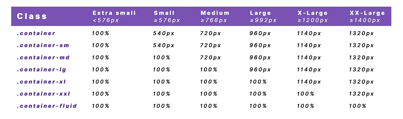
Bootstrap 5 responsive container
the container-breakpoint class contains content and other functions with the grid system. The breakpoint places the size of the fixed-width for particular devices. The container class acquires space inside of the body section. The responsive container shows the container as per device width.
The following table shows breakpoint with width size.